Make sure to check out the posts covering entries 100-91 and 90-81 and 80-71 and 70-61 and 60-51 and 50-41 and 40-31 and 30-21 and 20-11 and 10-1.
And here we are, launching into my top ten favourite Mondo prints of all time. Now, as we head into this list, remember that these are my selections, and no doubt your selections would be widely different than what is here. With that said, here we go…
10. If there were one property that I have been waiting for a perfect representation of in print form from Mondo, it would be Disney’s classic Pinocchio. I grew up watching Pinocchio, and feel that out of all the animated Disney films it was the one that shaped me the most. There is a purity and innocence to the character of Pinocchio that helps reinforce his naivety within the desperate and dark moments that he finds himself in.
After he manages to find himself in the darkest, dankest amusement park to exist, Pleasure Island (where’s the ride for this one Disney?), Pinocchio manages to escape. It’s a profound moment within the film where his journey to becoming a real boy takes a precarious path, Pinocchio finds himself with a tail and a pair of donkey ears. Things could not get worse.
That is, until he heads into the ocean and encounters the terrifying Monstro – a giant whale that consumes ships and destroys the ocean (Moby Dick, eat your heart out). It’s the one image that I have been itching to see – the culmination of events that have pushed this creation into the world: Pinocchio on a journey to find his father, instead encountering a sneering, giant whale. Jessica Seamans (one half of the great team Landland) did exactly that – Pinocchio stands in fear as Monstro hangs above him.
As a child, there was nothing more terrifying that the endless fury that drives Monstro, and here it is in print form, a salient reminder that even though we are born into this world as innocents, we are in turn moulded, and shaped by the world, and it is up to us to understand the paths we should take to be better people. Sometimes we embark on paths that we feel are the right ones, but turn out to be ones that bring about doom. Pinocchio’s conquering of Monstro with his father Geppetto by his side shows that he has finally learned to be a real, understanding, compassionate and empathetic real boy. It never fails to move me, and Seamans print accentuates that even more.
 Pinocchio – Jessica Seamans
9. I remember the exact moment that I watched Alfred Hitchcock’s The Birds. It was in summertime in 1994. I was ten years old and it was early on Christmas Eve at my grandparents house, and for some reason the TV was on and was about to play this Alfred Hitchcock film. My grandmother asked if I’d seen a Hitchcock film before, to which I said that I had not. We sat down and watched it, and from that point onwards I understood what a horror film truly was. I was terrified.
What struck me about Hitchcock’s The Birds, was the fact that danger lingers all around you. What may seem like an innocent entity within your day to day life, could quite easily become a spectre of doom and terror. The birds within The Birds appear to somehow work together, possessed by the desire to conquer mankind and take over the town of Bodega Bay. They first appear as innocent, harmless caged lovebirds that Tippi Hedren purchases in San Francisco, and eventually become harbingers of doom, swarming over a childrens playground, in turn painting it black.
Laurent Durieux presents Tippi Hedren heading off on a pier to leave the town she has come from. The lovebirds hang in her hand as a shadow of a hovering bird covers her. Importantly, she is alone, and if there one element from Hitchcock’s films to take away, it’s that terrible things happen to women when they are alone. As anyone who lives in Australia during the springtime when the magpies are out in force, you will know that it’s when you’re not looking at them that the terrible things may happen. Here, an unseen terror awaits Hedren.
Durieux’s choice of pastel colours works in some ways to mute the threats that potentially await for us all in plain sight. No matter how much we may run, no matter how much we may hide, the birds are all around us – from the skies above, to the cage in our hands. As ten year old me thought when I saw this for the first time, the birds will conquer us all.
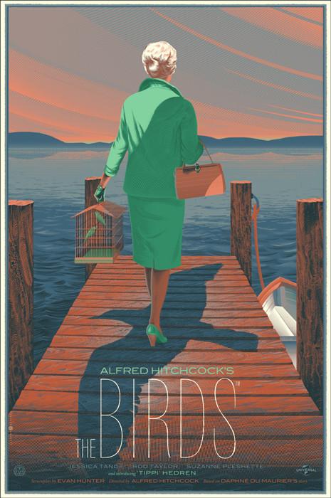 The Birds – Laurent Durieux
8. One of the quirks about the licensing agreements that Mondo has to deal with is that sometimes they can do a print for a film, but are in turn not allowed to include the credits of who actually made the film. So, while there is a print of Anthony Hopkins as his most terrifying creation, it oddly cannot be attributed to Hopkins himself, or director Johnathon Demme or Jodie Foster. All of which makes WeBuyYourKids print all the more better.
We so rarely get prints related to books – there are countless music related posters, endless movie posters, and a smattering of video game prints – so by happenstance, a print that is meant to be for Demme’s film in turn becomes a print for the great Thomas Harris book. This is not a point of contention – Demme’s film is a masterpiece of cinema. While this print does feel like it’s straddling the line of being a print for the film versus being a print for the book, it manages to stand on its own feet with the line ‘From the Terrifying Best Seller’.
Semantics aside, what works so perfectly about this print is that it’s a representation of Clarice Starling from the perspective of cognisent madman Hannibal Lecter. His drawing within the tale of Clarice shows her as the Virgin Mary, and in place of where Jesus would be, she is holding a lamb. Clarice is presented here as a skull like spectre, yet she is still caring for something other than her.
Lecter adores Starling, he doesn’t want to hurt her at all – ‘he would consider that rude’ – and in many ways, this representation of his minds eye is reminder of how sacred Clarice is to him. Behind her a hand hovers, a mother floating in flight above it. As much as he adores Starling, he equally admires the work of Buffalo Bill – he who owns the hand that hovers.
There is a unity between killer, and those who investigate the deaths that result from the killers actions. Clarice Starling’s tale about waking early in the morning, terrified after the death of her father, she runs into the darkness of a farm. She stumbles upon a barn where the spring lambs are being slaughtered, their screams break the morning silence. Clarice tries to save just one lamb, but the weight of the lamb is simply too much – she is eventually exhausted by the weight of it, and cannot run any further. The lamb is taken back to the farm and killed and Clarice is sent off to an orphanage. Naturally, as Lecter states, there is a relationship between Clarice trying to save the lambs and Clarice trying to stave off any future victims. It’s a weight of which she will never be free from. The hidden faces within the print remind us of the endless souls that have been lost and that Clarice will never stop trying to avenge.
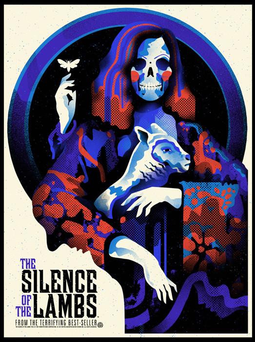 The Silence of the Lambs – webuyyourkids – Regular
 The Silence of the Lambs – webuyyourkids – Variant
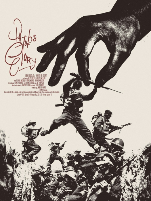
7. As I’ve mentioned throughout this series, Jay Shaw sits alongside Martin Ansin and Kevin Tong on the Mount Rushmore of Mondo artists. While he creates an endless supply of stunning prints – everything from Repo Man to High-Rise, from The Act of Killing to Ed Gein – he continually challenges and surprises with his output. Making his sixth and final entry on this list is Jay Shaw’s Paths of Glory.
We each have our own favourite Stanley Kubrick films for our own specific reasons, and while Dr Strangelove is up there for me, I keep coming back to Kubrick’s damnation of the act of war with Paths of Glory. This is a devastating portrayal of the ludicrous nature of war – the use of men like pawns with pure disregard for their emotions. Shown in black and white, this is Kubrick creating his most emotional work. It’s hard not to be broken by the journey that Kirk Douglas’ Colonel Dax schleps down in his path to defend his soldiers.
Shaw’s typography is a scrawl of fury, as if he’s spitting out the title of the film. At once, this appears to be a comical portrayal of a hand plucking a man out of a trench, as if this were a Monty Python take on war. However, thanks to the genius artistry of Jay Shaw, the apparent element of comedy simply does not exist here. This is a print drenched in dread.
In the midst of this madness, a man, a fellow soldier, is plucked out of the trench. His face is clouded in darkness, yet his body suggests shock and confusion. These are the apparent ‘paths of glory’ that the soldiers fight on. Elsewhere, the distracted glances of men search all over for some kind of guidance to direct them where they need to go. Meanwhile, men breach the trenches, running into certain death.
It’s powerful, it’s impressive. It’s what I want from a film print – something that doesn’t exactly feel like a promotion for the film it’s presenting, but rather a furthering of the conversation that the film instigates.
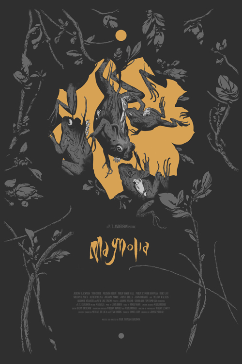
6. Again with the hands. This time, instead of holding onto something, they’re bursting out of an array of frogs. It’s bizarre imagery that is surrounded by a sea of black. A golden flowers blooms behind these disturbing amphibians. It raises so many questions, while providing so little answers.
How does one contain Paul Thomas Anderson’s sweeping epic into one image? It would be easy to have a floating head piece of every character within the film, but that alone isn’t even scraping the surface of what the film is about. For me, this is my favourite film, and while the original one sheets are truly sublime, it’s João Ruas’ work that has managed to evoke the feeling of Magnolia in the best way possible. Everybody is connected, and through darkness and devastation, hope will arise.
Unlike the other entries in the top 10, I don’t have an endless amount of words to say about this print other than ‘just look at these close up shots’.
5. Is there anything more stunning and beautiful in the Mondo catalogue than Kevin Tong’s Mulholland Drive print? I really don’t think so. Both the regular and the variant editions are sumptuous and stunning. The likeness of Naomi Watts and Laura Harring are spot on. The wide eyed wonder of Watts is one that’s full of hope and desires, and Harring’s sly, knowing smile hints at the darkness in the world of glitz and glamour.
The criss-crossing floodlights at the bottom hint at a world of lights and excitement. They hint at Hollywood. The simplicity of the imagery is key – by allowing a central motif to sit by itself is smart, yet, lesser artists would see the emptiness and feel the desire to fill it with something. This feels like the pinnacle of a career as an artist – where every piece that Kevin Tong has worked on has been in a bid to make this one print.
The next text is something I wish I had written in regards to the relationship of artist MC Escher and David Lynch and the nature of surrealism, but I didn’t. Instead, I’ll let a user from the print forum Expresso Beans take the stage:
David Lynch is a surrealist, Escher is a surrealist. Mulholland Drive’s main theme is identity. The film is labyrinthine, constantly folding upon itself like a mobius strip. Tong is paying homage to one surrealist by invoking another while nailing the film’s core concepts.
 Mulholland Drive – Kevin Tong – Regular
 Mulholland Drive – Kevin Tong – Variant
4. Roy Lichtenstein’s work is sublime. It presents the comic strip as a parody, taking the often over dramatic serials and flipping it on its head. It’s stunning stuff and well worth trawling through, and then, in turn, trawling through the many artists who have been inspired by his work. While parodies of a parodies can be cringe worthy, there’s something truly brilliant about one that just works.
Wes Craven’s era defining Scream is a parody of the films that Craven helped establish. It takes the slasher genre and flips it on its head. That genre had grown stale and tired by the time Scream rolled around and shook things up. One of the key aspects of Scream’s success was taking the casting of Drew Barrymore, and subverting the above the marquee status that her name would have dictated at the time by having her being killed dramatically in the opening scene. It’s stunning.
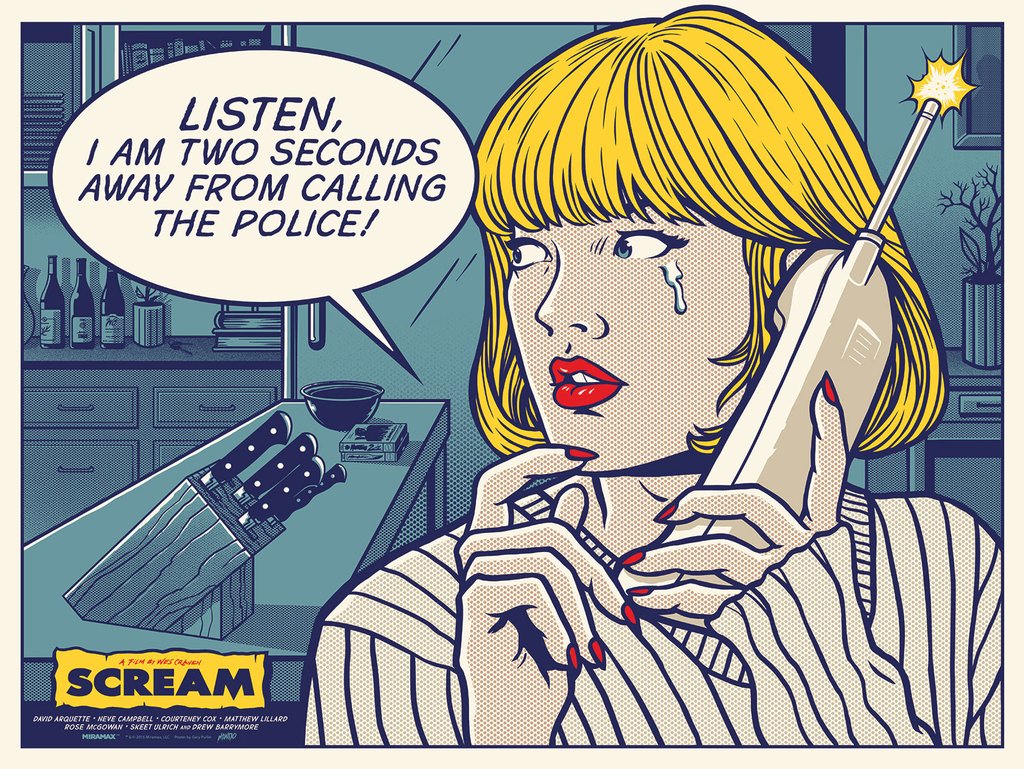
The confusion as to who is the killer is one of the key tenants of the Scream series – the unknown terror and the fear of a masked thug is powerful. What’s even more terrifying is a voice on the other end of the phone who is taunting a potential victim. Visualised terror is frightening, but an unseen, unknown terror is even more terrifying. The quote helps reinforce the frantic fear from Drew Barrymore’s Casey Becker. She’s trying to regain the upper hand in a situation that has wildly fallen out of her favour. ‘Listen!’ ‘I am two seconds away from calling the police!’ The insanity of the situation hasn’t properly hit Casey, her adrenaline is causing her to not think straight.
Gary Pullin’s work is regularly in the realm of horror, and he consistently hits it out of the park. This print has him working on a whole different level. While most Scream prints would feel the need to include Ghostface (the mask itself a parody of the iconic Edvard Munch painting The Scream), it takes restraint to hold back from showing the iconic mask. There’s not even a sly hint or easter egg of the mask – I believe at one point there was the possibility of the mask being hinted as the ‘shock’ effect at the phones antenna. To take an idea like Lichtenstein’s parody work and in turn apply it to the work of one of the greatest horror parody’s around is genius. To actually bring that concept to life and execute it perfectly is another thing. This is an all-timer.
 Scream – Gary Pullin
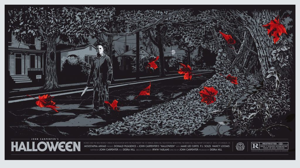
3. Besides the iconic John Carpenter score, what’s the first image that comes to mind when you think of Halloween? For me, it’s the mysteriously ubiquitous aspect of Michael Myers appearing out of nowhere. Myers appears behind unknowing teens, ready to dispatch them in the night. Carpenter’s film mainly takes place on a quiet night, with the darkness enveloping most of the characters. It’s in this darkness that fear resides – fear of the unknown and fear of the unseen.
Ken Taylor’s print presents Myers in the middle of a street with his fear inducing knife in his hand. His face, as we have grown to dread, is blank and emotionless. Whatever this man wants, it cannot be good.

Yet, even though he stands alone in this empty street, he is surrounded by a chaotic array of leaves. A tree stretches out over him, having exhausted itself of many of its leaves. The lone moon in the sky hovers like an omnipresent eye, tucked behind suburbia – almost like an unwelcome being. The mass of leaves suggests an inevitable change on the horizon – and one that Halloween helped wreak on the film industry, with the ‘slasher’ film essentially established with Carpenter’s classic.
Red leaves pepper the vista, like a smattering of blood on a bedsheet. As you may have noticed throughout this list, there is a greater representation of horror films than you may expect. If there’s one element of Mondo’s output that is their bread and butter, it’s the horror genre. Heavily represented in this genre group is Halloween. Ken Taylor’s work is regularly stunning – so much so that it’s no surprise that he has a legion of imitators (but nobody better than the original) – and it’s with this Halloween print that represents the best of his work.
It’s here that Ken Taylor takes the mantle alongside Jay Shaw, Kevin Tong and Martin Ansin on that hallowed ground that would be the Mondo Mount Rushmore of artists. Artists who have displayed a profound versatility within their work, while also presenting some of the greatest screenprints around.
 Halloween – Ken Taylor – Regular
 Halloween – Ken Taylor – Variant
2. In 2011, the legitimacy of Mondo’s output was made official when the Academy of Motion Pictures Arts and Sciences decided to archive Mondo’s output in their Margaret Herrick Library collection. One of the first entries into that collection was Drew Struzan’s powerful work for the classic Universal Monsters film Frankenstein. Paired with artist Ken Taylor (who did the typography) and with the assistance of Kevin Tong (who did the separations), Drew Struzan’s painting comes to life in print form.
Where to begin with such a work of beauty? Whether it’s the suggestions of lightning strikes that frame both Dr Frankenstein and his monster, or the lifelike presentation of a raging fire, with its embers floating in the wind, there is nothing but pure brilliance and respect for a film within this piece of work.
Boris Karloff’s tortured monster is shrouded in sadness, his visible eye covered by a shadow that suggests he’s wondering exactly what he is. Colin Clive’s scowl suggests he is well aware of the devastation that he hath wrought, and is almost just waiting the inevitable fury that will be brought to his doorstop.
And that typography! Oh my. The title alone is stunning and evokes an era in the best way possible. You can’t help but feel transported to the 1930’s and that you’re in a different world. I can only imagine this exact poster hanging as a promotional tool way back when. It’s timeless. A powerful, important print.
 Frankenstein – Drew Struzan with Ken Taylor
1. If/when my midlife crisis hits, I’ll be seeking down a copy of this print to buy and frame and just sit and stare at til the rest of my days are worn to nothing.
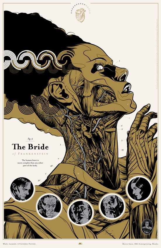
The desire to be a creator and, in turn, a creator of mankind, is one that has been explored throughout cinematic history. What does it mean to play God? But, most importantly, what does it mean to be the creation of a man who thinks he’s playing in God’s wheelhouse? Both Frankenstein and The Bride of Frankenstein are as much about humanity, as they are about what makes us human.
Where the first film showed Boris Karloff being perplexed by the beauty of life – as seen in a devastating moment where he drowns a young child -, the sequel presents us with the monster struggling to understand the humanity that is forced upon him. Life, it seems, is painful. People fear him, and people struggle to accept his presence. So, when the monster is finally presented with an equal – a manufactured bride who is designed to be his love -, and she rejects him, he resorts to destroying the world he lives in. It’s traumatic and depressing. Just because she is his equal, does not mean that the Bride herself will not fear what he is, and in turn, what she is.
Martin Ansin is at the top of his game here. The anatomical work displays the makings of a monster, while also showing the layers in what makes us human. Just because one has the same physical makeup as others, does not in turn make them equal to everybody else. The position of the Bride’s head suggests that she is well aware of her manufactured beauty. Her iconic white streak loops in curves.
Below her face lingers the images of the many figures who helped bring her into existence. There is no sign of happiness here, these are weathered, tortured figures. Some of which hang their heads in shame at their actions. Their inclusion is essential in providing an understanding of who the Bride is.
In the realm of screenprints, or really, in film related artwork in general, there is no better that Martin Ansin’s The Bride of Frakenstein. I’m certain this is the benchmark of talent that many artists strive for. And what a high benchmark it is.
 The Bride of Frankenstein – Martin Ansin – Regular
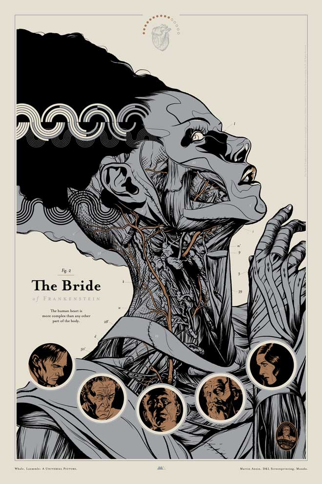 The Bride of Frankenstein – Martin Ansin – Variant
And that folks is my Top 100 Best Mondo Prints. Hopefully you’ve enjoyed reading through this list and seeing what art I enjoy. Please share what your favourite prints are!