On this eight entry in the Top 100 Best Mondo Prints, I cover entries 30-21.
Make sure to check out the posts covering entries 100-91 and 90-81 and 80-71 and 70-61 and 60-51 and 50-41 and 40-31 and 30-21 and 20-11 and 10-1.
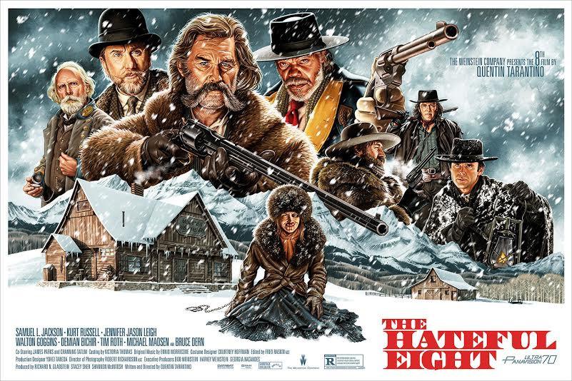
30. Quentin Tarantino’s caustic epic The Hateful Eight is a film that documents the foundations of America on one cold, stormy night. Racism, hate, misogyny, distrust, all are laid bare in a film that takes no prisoners. It’s bloody, it’s funny, it’s disturbing, and it’s damn well violent.
The brunt of a lot of the violence is Daisy Domerghue (Jennifer Jason Leigh), who us beaten bloody by John Ruth (Kurt Russell) and is for the most part, the central focus of the plot. Jason Edmiston’s print is terrifying in its portrayal of misogyny and violence. Every man is a potential villain, and every man has an agenda. Kneeling in the snow, bloody and beaten (but most importantly, not broken), Domerghue smiles. Nothing can touch her.
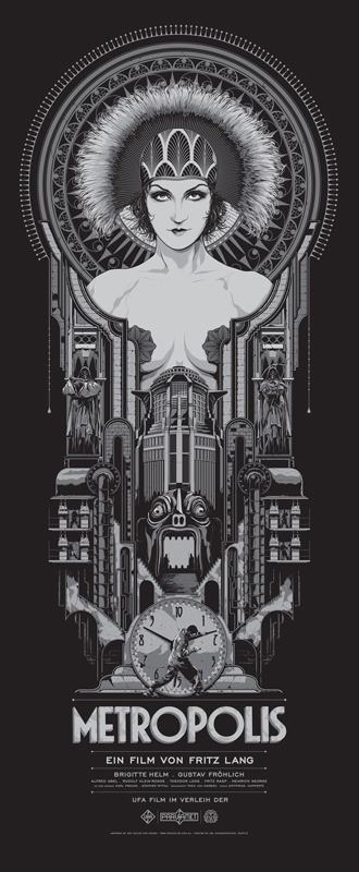
29. The first entry in Ken Taylor’s early film trilogy (the second being Nosferatu above, the third on the way) is the iconic Metropolis. A regular film in the Mondo print rotation, with artists like Martin Ansin and Kevin Tong having presented their takes on this classic film. While Ansin’s is a true great, it’s Ken Taylor’s presentation that hits the right notes for me.
At the bottom of the print, a man struggles with the weight of society on his shoulders. His legs are buckling, his head crooked back in pain – this is all too much. The industrial revolution is almost too much for society, with the imminent arrival of robots to supersede humans a prescient fear. The silver ink shimmers, giving the illusion it’s a slice of the silver screen in freeze frame.

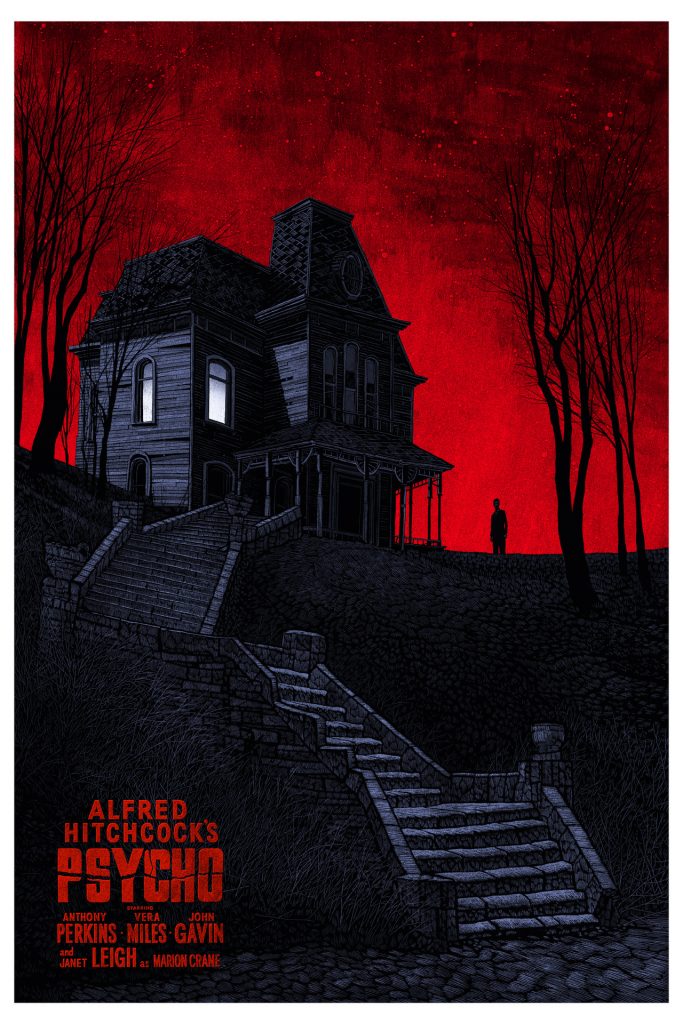
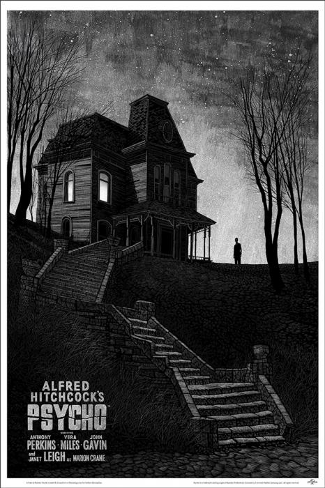
28. Another print that seems almost too simple – almost too obvious. Daniel Danger is an artist who labours for hours on his works of art, often presenting houses or rooms in disarray. It’s eerie, dark and frightening stuff. The taglines at the bottom of his works often tell a story of mental illness, or pain, or deep, strong emotions.
The pairing of Danger with the iconic house that Norman Bates and his mother live in is as perfect a pairing as any. The house looms above the viewer. Norman stands in silhouette, equally staring down at the viewer, watching. It’s daunting and ominous, and draped in darkness alongside the title Psycho, you can only imagine what terrible events have occurred in there. Not one for the babies room.
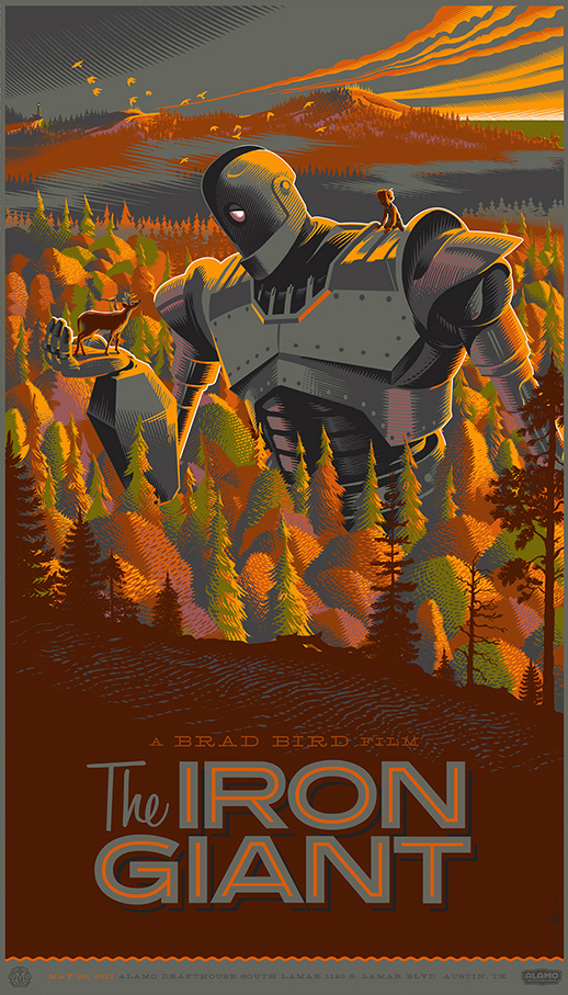
27. Brad Bird’s The Iron Giant is a film about the innocence that can exist within a being designed for brutality. Where that being is a giant robot, it’s easy to replace that robot with humanity. We have the power to be violent, brutal creatures, but are also capable of supreme innocence. The film is equally about a relationship between a boy and a foreign being, and childhood.
Laurent Durieux’s imagery here shows the Iron Giant sitting in a forest, in awe of the beauty that surrounds it. Durieux presents a question to us all through the perspective of this film – how can we cause so much pain and death, when there is so much beauty in the world? This print is heartbreaking.
26. Daniel Danger again – this time with Stephen King’s The Mist. It’s a bit of a spoiler for the ending of that film, and I won’t deny that having this print hanging in my house is a right downer at times. But, Danger’s use of shades of white and light blue is oddly calming.
It’s almost like Danger is presenting peace within a moment of madness. Death has come to the characters who we have come to know and love throughout a traumatic event. The end of the world at the legs of mammoth beasts from unknown worlds seems imminent. Yet, it’s beautiful and trance-like. Like staring into the abyss and seeing a world of disfigured beauty.

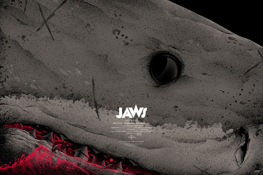
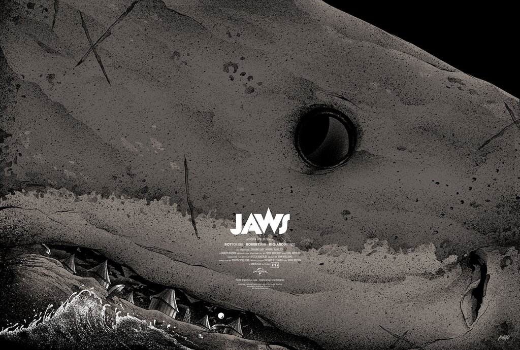
25. Yes, I’m well aware that Laurent Durieux’s Jaws print exists and that many consider it the Jaws print outside of the original poster. However, I’m going to throw out a small gimme for this particular entry – while Jaws is a truly brilliant film, I have personal issues with its legacy that stop me from loving it.
What I do love though is sharks. I’ve grown to appreciate them and recognise their value in the ecosystem that is the oceans of the world. For that reason alone, this superb portrayal of the head of a shark by Matt Ryan Tobin is what puts this print so high on the list for me. The regular version follows the less dramatic route of portraying the sharks teeth with no blood, with the teeth being replaced with beachside shacks as a nice easter egg. It’s a superb print that almost could be for something other than Jaws.

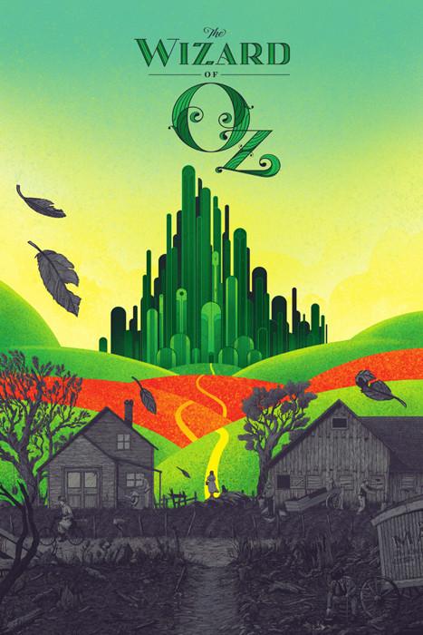
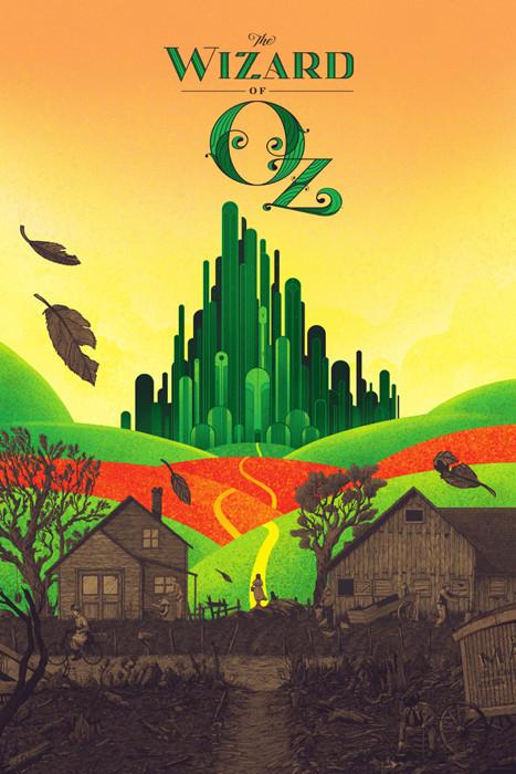
24. Like Kevin Tong’s The Invisible Man print that has come before this one, the jpg of his The Wizard of Oz prints don’t do the print justice. A bright, garish Emerald City sits in the middle of a beautifully portrayed vista, with Dorothy and Toto dwarfed by its enormity. The path that lays ahead of them is one of uncertainty – they’re in a strange world, and they have no choice but to leave their previous life behind to progress forward.
Tong’s use of metallic inks to showcase the black and grey, or weathered celluloid look of the Kansas set scenes of the original helps differentiate the two worlds. To be able to showcase two opposing worlds, almost in harmony is something truly wonderful. Tong’s use of space to direct the eye to important elements is also a really wonderful touch, with a wayward leaf floating in the dying tornado winds amplifying that contrast between Oz and Kansas.
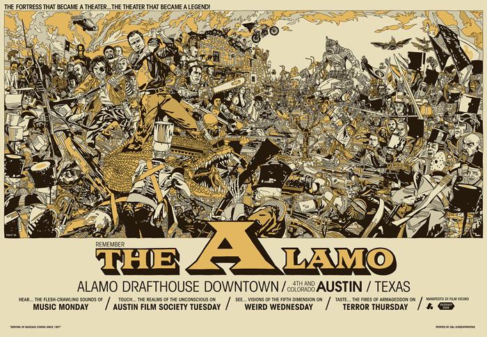
23. Possibly one of the more controversial choices on this list is the decision to put Tyler Stout’s Remember the Alamo print as his best print. First, the fact that I’ve neglected to put all the generally considered Stout classics here may ruffle a few feathers (yes, no Blade Runner, no Guardians of the Galaxy, no Kill Bill, no Star Wars). And secondly, the fact that I’ve put a print that celebrates the institution that is the Alamo Drafthouse with all its current issues raging on.
Well, I understand your criticisms and respect your point of view. I do admire Stouts work, but I have often found that it is a fancier version of the ‘floating head’ posters that are at epidemic proportions in cinemas today. They’re damn good, and contain insane artistic talent (there’s a reason Stout is one of the best artists in the game), but for me, they just don’t hit the same spot as other entries on this list.
What does work about Remember the Alamo is that this print is not only an ode to a cinema that helped restore the sanctity of cinema, but it’s also an ode to the art of film itself. Playing like a Where’s Wally? print, but instead of Wally it’s cinema, this pits cinema icons against one another. Kurt Russell battles the monsters from Clash of the Titans, while Evel Knievel launches himself across the crowd. It’s madness. It’s insanity. It’s everything that cinema is. An ode to a monumental theatre chain, and an ode to a monumental art form.


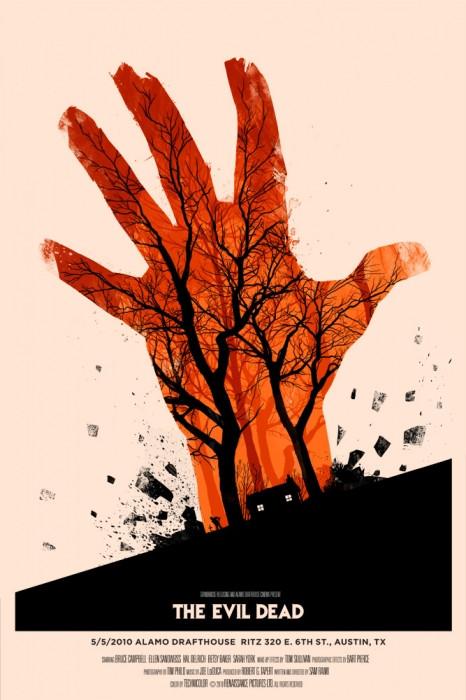
22. Olly Moss’s Evil Dead portrays a fiery hand, bursting through the earth like a demon unleashed. The world outside the realm that this demonic hand covers is absent. Only evil remains.
Naturally, body parts play a major role in Sam Raimi’s classic genre flick – specifically hands. The iconic house is dwarfed by this monumental beast of an appendage, with the trauma inducing trees making up the veins of the hand. The slanted earth, the great cream coloured open space, the deep orange – everything in this print is so perfectly placed and designed. There’s a reason this commands a price of $1000+ on the aftermarket.


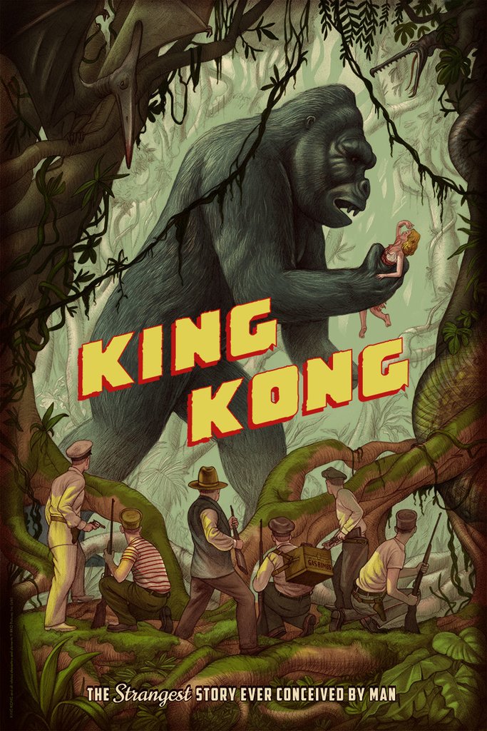
21. While there are two prints that Jonathan Burton has released for King Kong, this particular entry is for the ‘Jungle’ variant of the print. The cityscape version is impressive, and the image of this great beast being dwarfed by a city is powerful, but it simply can’t compare to the sight of Kong standing in the jungle, perplexed by the beautiful woman he holds. Interestingly, the two designs were voted on by a panel of fans at the second Mondocon event in Austin.
As the tagline suggests, this is the strangest story ever told by man – and really, it’s up there. A giant beast unlike any that humanity has ever seen, discovered on a remote island full of other fantastical beasts. Yet, while it’s pure fantasy, the film dedicates a great amount of effort to showcasing the emotions of Kong himself. Burton’s print displays this emotion as well, Kong’s mouth hangs agape, in awe of the shocked Fay Wray. The men are also in awe, standing behind the tangled roots of the trees of the jungle. The hidden creatures within the vines add a level of mystery to the jungle as well. Then the typography holds it all together perfectly.


And that’s it for this round. Come back tomorrow as we launch into the Top 20 Best Mondo Prints…
